
Mohammed Radhee Ghadheb
The General Directorate of Education of Baghdad, Iraq
Oday Abdulhameed Majeed*
Institute of Applied Arts Middle Technology University, Iraq
Furat Jamal Hassan
University of Baghdad, College of Fine Arts, Iraq
*Correspondence concerning this article should be addressed to Dr Oday Abdulhameed Majeed, Institute of Applied Arts Middle Technology University, Iraq at [email protected]
Contrary to deconstruction and its destructive pursuit, the concept of undermining the familiar seeks to refute the constants and its known limitations. It is done through the process of receiving and what is imposed by the formation of the word or text or the structural and design structure in general, along with the Arabic calligraphy in particular. This is based on the recipient's understanding and interpretation of the dual phenomenon and the content's manifestation. More accurately, the disclosure of its reality through its expressive phenomenology; for that sake, the research was devoted to studying "undermining the familiar and embodiment content in Arabic calligraphy" including four chapters. The first chapter comprised the methodological introduction, the second chapter dealt with the concept of undermining the familiar and its representations in Arabic calligraphy, and to embodiment the content along with its use in Arabic calligraphy. While, the third chapter represented the research procedures and the community reached (32) compositions, in which the analysis concluded several results. The fourth chapter clarified the most important concept. The sample calligraphers were able to focus on the design relationships of the theoretical framework. The current study acquainted with undermining the familiar and embodiment of the content for those concerned and interested in the art of Arabic calligraphy, it also focused to benefit from the energies of letters and their constructive movements in building, modernizing, and renewing the arts of Arabic calligraphy. Moreover, the research also suggested studying the design treatments in order to embody the content in the formations of Arabic calligraphy.
The art of Arabic calligraphy introduced many strides throughout the ages and historical stages due to its structural flexibility and pliancy of all its letters and vocabulary to appear according to the available design field. Merged with its aesthetic diversity and attractiveness which reflected the preservation of its originality and significance? Altogether, it revealed countless artistic developments and no limits, between the extent of the ingenuity and skill of calligraphers along with the implementation of their products according to the requirements of use as they engraved and decorated the Holy Qur’ān with it. This act was carried out by mastering the letters of the Holy Qurān and its sacred verses, all the way to paintings and architectural buildings.
Their creative horizons broadened to encompass the emerging field of installation art and the forward-thinking concepts behind it, going far beyond the grammatical proficiency of the various fonts with which they had previously worked. Resultantly, the motivation for the formation of unfamiliar modern meanings, as perceived through the artistic acts of the calligrapher, started to take on a wider variety of shapes and concepts, skipping over the normal repetition and stereotyping.
The current study intended to recognize the content's embodiment and undermining of the familiar in Arabic calligraphy.
Objective Limit: Arabic calligraphy works with an orientation that undermines the familiar and embodies the text on paper in Al-Thuluth calligraphy.
Temporal limit: This is due to the availability of Arabic calligraphy products that undermine the familiarity and embodiment of the content from (1420-1440 A.H.)
"A verb of three letters undermining the building by destroying it without demolishing" is how (Al-Razi) undermining is defined.
Double reading, as Derrida put it, is an affirmative process that strives to investigate the text in question, whatever it may be, in order to ascertain its meanings and secondly what it conceals without a statement.
In order to demonstrate its novel effect, the researcher defines it procedurally as an invitation to read the text in accordance with the frame of reference in which it is positioned first and then the overall contents of its development.
In order to demonstrate its novel effect, the researcher defines it procedurally as an invitation to read the text in accordance with the frame of reference in which it is positioned first and then the overall contents of its development.
1.1. The Concept of Undermining the Familiar and its Representations in Arabic Calligraphy
The concept of undermining is a term that its producers seek to oppose the familiar and move away from stereotypes, especially by reading it analytically in order to achieve the same recipient reader through his conscious reading. It helps to prove his existence and to deal with the text in all its diversity which results in effective participation that achieves the purpose of the text, it's coding, and the directed message. This inherently elevates the product to the stage of creativity and contrasts with the familiar as well as its distinct impact. Perhaps this trend may lead to what Derrida called “double reading to reach the metaphysics of thought and transfer it through translation into Arabic under the name of deconstruction and undermining, the antithesis of deconstruction and its destructive pursuit1
It confirms that there is an existing and close integration between becoming and essence in order to intensify the aesthetic values.2
Therefore, it is natural for a reader to feel it and interact with the written text through its updated and expressive phenomenology. There is no doubt that modernity seeks to monitor transgression, displacement, disruption of the norm, the fading of the authority of past and emergence of new to make it capable of continuity without which the initial perceptions would have been petrified. 3Specifically, it is contended that the perception of the recipient as being more open to innovation, modernity, and objectivity leads to greater presence, survival, continuity, and permanence as a perceptible perception and this undermining textual output is familiar that the researcher-explored. It has several representations available in the art of Arabic calligraphy including the following.
1.2. Undermining the Familiar Expressions
"A calligrapher works on the word and its contrast with the familiar and undermining in order to achieve the self and prove the ability, skill, and open mindset. Figures (1, 2, and 3) show the power of their producers, especially the updated aesthetic design templates and their distinctive impact on Arabic calligraphy art with the limited functionality of those words and their scarcity and abundance. It alone does not provide the calligraphers with the opportunity to achieve their desired artistic objective.
|
Figure 1. Undermining in the word of “kulhom” |
Figure 2. Undermining in the word of “eishq” |
Figure 3. Undermining in the word of “Rahman” |
1.3. By utilizing the Line System and its Variants, the Familiar is Undermined
The active producer in the art of Arabic calligraphy always seeks to disrupt the vision of the recipient in order to complete the communication process and achieve the desired goal. By utilizing the line system and its variants, the familiar is undermined. Moreover, some of them did it with unfamiliar undermining representations which may be monitored in the linear system with multiple works according to Figures (4, 5, 6, and 7). The description in its artistic formations indicates the design intent that undermines the familiarity of the representations of the Al-Thuluth calligraphy and its aesthetic impact. Especially, it indicates the stereotyping of letters, syllables, and the general form which is outputs representing the ability and skill of its calligraphers along with their distinctive innovative patterns.
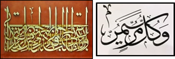
Figure 4. Undermining with the usual lines and words Figure 5. Undermining in the line
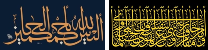
Figure 6. Undermining in words Figure 7. Undermining in the line and words
1.4. Using Calligraphic Structures to Challenge the Traditional
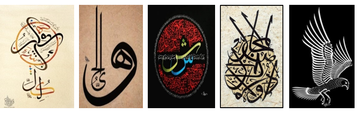
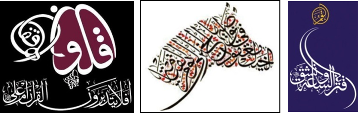
The most important thing that a calligrapher reaches in the art of Arabic calligraphy is the art of calligraphy which results in the outcome of many experiments. It represented a compliant result and accepted its vocabulary indicated by letters, words, and syllables in some types of lines for representation and design websites available. According to artistic forms (geometric, free, and iconographic), these artistic structures were worked on by calligraphers to show the extent of their technical capabilities and skills in Figures (8, 9, 10, 11, 12). The calligraphers relied on these artistic forms to transcend the stereotypical appearance in order to establish approaches, bearing the artistic depth that accommodates privacy and distinctive artistic uniqueness.
|
Figure 8. Undermining in animal iconographic |
Figure 9. Undermining in literal structures |
Figure 10. Undermining in free structures |
Figure 11. Undermining in the composition of the two words |
Figure 12. Undermining in various compositions |
1.5. The Representation of Content and its Work in Arabic Calligraphy
In the beginning, the researcher monitors the concept of embodiment content and its artistic use and establishes that it has a direct relationship with the wording, meaning, and the deliberation of words, their context, and whether they exist or not. Afterwards, it penetrates into the science of semantics and the theory of form and their importance including the visions and ideas of critics, philosophers, and contemporaries who followed all the same paths. This may be perceived by the recipient to receive through signals, symbols, the meaning of the form, and its overall appearance.
It was pointed out by (Pearce) and his followers that "the trinity of the icon, the evidence, and the symbol which searches between the signifies and the signified under the concept of the sign and its ease of recognition," is a key concept in this regard."4
The guide for the semiotic lesson was the Holy Qurān5 and several verses in this regard flow in a continuous sequence to reinforce its branching and it has been demonstrated clearly transcending through the book "The Meaning of Meaning". It was mentioned by "Al-Jarjani" on the subject of significance, describing it as "the existence of a thing in a state in which knowledge of something is required." The first thing is the signifier and the second is the significance.6
From these starting points the researcher assumes and this comes as a result of its structurally woven mark to become an artistic effect to be characterized by openness, pluralism, and non-closure. In particular, the researcher in front of a huge amount of concepts is related to the embodiment of the content in the sign and what it contains.
The more expressive and symbolic this embodiment was, the more grounded, beautiful, and distinguished. What reinforces these trends is the visual outcome, verified from the semantic action of the structural characteristics of the linear formation in the light of the requirements of situations that derive its initial stimulus from the meaning of the text.7 On the other hand, these connotations achieve an expanded vision of the formal sense and access to improve stimuli for the artistic ideas of the procession of Arabic calligraphy.
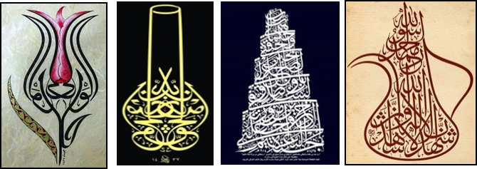
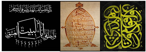
Additionally, the formal appearance of some texts of the works of the art of Arabic calligraphy according to bodies do not reflect their contents, rather render them to highlight their potential and skill in the formal, iconographic implementation in which they simulate a body available in reality, whether it is a "sign, sign, icon/human, animal or plant." Moreover, the Figures (13, 14, 15, and 16) show the extent to which its calligraphers borrow an iconographic body or something else for the artistic formation. The researcher is specifically concerned with the embodiment of the content that expresses the accompanying frames’ paintings of the content and its frames’ paintings.
|
Figure 13. Embodiment of content in botanical iconographic compositions |
Figure 14. Embodying the content in the word of “almisbah” |
Figure 15. Embodiment of content in architectural iconographic compositions |
Figure 16. Embodiment of the content in the iconic iconographic compositions |
The best of the saying, as the researcher sees, is that the general form is the artistic structure which is self-sufficient to express the self and content simultaneously. This artistic becoming is embodied behind several experiences which brought its producers their self-awareness to distinct artistic forms. It led them to what is not familiar for reproduction, modernity, and artistic novelty.
1.6. The Use of Words to Convey Meaning
The researchers conclude that the best interpretation of the proverb is that the general form is the artistic structure that is adequate to express both the self and the content. Moreover, this artistic becoming is embodied behind it by a number of experiences that brought its producers their self-awareness to distinct artistic forms which led them to what was previously unfamiliar in terms of reproduction, modernity, and artistic novelty.
Consequently, the researchers recognize the codification of the content to be embodied in the form of the words themselves so that the meaning is merged into form and content including the iconic form in the thought line or through dictating draw for those linear products with graphical contents (17, 18, 19, and 20).
Spelling and freeing it from realism through the membership of each part to complete the general framework demonstrates the professionalism and competence of its expressive and distinctive makers.

|
Figure 17. Embodiment of content in the word and flag |
Figure 18. Embodiment of content in the word and its inversion |
Figure 19. Embodying the content in the word and reducing it |
Figure 20. Embodying the content in the word and prostration |
1.7. The Embodiment of Content through the Line System and its Variations
The design structure and how it is constructed morphologically is one of the most appealing aspects of depictions of the art of Arabic calligraphy including line systems. Moreover, the most notable artistic works are accomplished by relying on the text and the extent to which its content and expressive images are activated as according to Figures (21, 22, and 23). The description in their general forms indicates evidence to evoke the significance of the texts at hand.
This is evidence that their makers care about keeping Arabic calligraphy alive and well on one hand and about the quality of their work and the novelty of their designs, on the other. Whereas, the source of the stylistic influences reveals the author's level of expertise.

|
Figure 21. Embodying the content in the line and its levels |
Figure 22. Embodying the content in the line |
Figure 23. Embodying the content in the line, its levels and parts |
1.8. The Representation of Content through Structures
Linear structures have a specialty for calligraphers because the researchers need to be subjected to an almost architectural system for artistic appearance and development as these design systems depict a variety of technical meanings. These designs and systems represent a variety of technical meanings, however, it gives a specific form that shows an iconographic, geometric, or free meaning. Most of the calligraphers worked on it to activate the essence and content in the external appearance of the design structures formally. This form is, in fact, the matter. It is “the most important cornerstone of the building blocks of the artistic work, as well as the material medium, subject, expression,”8 as are the figures (24, 25, 26), which came according to its semantic features. The importance of the form and its distinctive impact, through the general phenotypic orientation calls to that judgment and this is what made it easier to receive more assimilation and acceptance by the viewer and more precisely for the above.
|
Figure 24. Embodying the content in the structure and the line |
Figure 25. Embodiment of content in animal iconographic compositions |
Figure 26. Embodying the content in the diagnostic iconographic compositions |
The practice of undermining is an orientation that belongs to the text's producer which leads to output ranges that are in harmony with what the producer wants to disclose, to satisfy his artistic passion on one hand. This applies to the recipient who seeks to contradict the traditional and stereotyped, reaching the text's main foci and its objectification and general composition.
The calligrapher achieves creativity by challenging the unfamiliar and a quest to build which is the polar opposite of the name deconstruction and quest for destruction.
The concept of undermining the familiar is represented in Arabic calligraphy which was discovered in the word, the line system, and the linear structure
The undermining of the familiar revealed a difference from its usual stereotype, demonstrating the ability, skill, and mentality of its open calligraphers, particularly the updated aesthetic design templates and their distinctive impact on the art of Arabic calligraphy on one hand and the limited operation of these words, their scarcity, and abundance on the other due to their being alone. It denies the calligrapher the opportunity to achieve himself and his desired artistic goals.
The researchers adopted the intentional method to select samples that represent the research community, reflecting its characteristics, as the total sample amounted to (3) models and the similar ones were excluded because it included descriptions in the selected sample, as the samples constituted (10%) compared to the total community.
|
Sample 1 |
Sample 2 |
Sample 3 |
3.1. Sample No. 1
The text: "ثُمَّ لْيَقْضُوا تَفَثَهُمْ وَلْيُوفُوا نُذُورَهُمْ وَلْيَطَّوَّفُوا بِالْبَيْتِ الْعَتِيقِ" سورة الحج (29)"
Chapter (22) sūrat l-ḥaj (The Pilgrimage), Verse (22:29)
Calligrapher: Saeed Al-Nahri
Country: Palestine
Achievement year: Unknown
The calligrapher sought to create this written composition in order to rely on the thuluth line. His words were distributed according to a simple structure into two syllables one above the other, as he designated the first upper level to represent part of the Qur’ānic text. "Then, fulfill their vows, according to a single system, according to a linear level". It was followed by the second lower level to complete the text "and circumambulate the ancient house" and its appearance in the form of an iconic structure which suggests the shape of (the Kaaba) and its rendering to give the recipient the feeling of square shape similar to the Honorable Kaaba.
Specifically, the "Rose and م" signs, superimposing the first on the last to compensate for the movement of the pilgrims and their circumambulation around the Kaaba while raising their hands to pray and asking for forgiveness. Moreover, the needs that go through their minds, describing these variations contribute to the interaction of the viewer's visual sense and contribute to the formal and aesthetic intensification of the content along with its exclusion.
The spread of these formations expresses the implications to determine the one destination of prayer that is its manifestation in a vision to mimic the formal embodiment of the textual content itself.
This is a conflict between the calligrapher's ability to seek artistic advancement and the constants that push the viewer and recipient to interpret the artistic effect and the images associated with it, drawing them from the text's subject matter and contents.
The calligrapher’s keenness to lengthen extends, and changes the paths of some letters and formations to complete the technical goal and the formal content must not be missed. This came by calling the word "in the house" and adapting the literal (أ) (أ) from the word that preceded and followed it, especially "dagger أ" under the same word to complete the construction of the body. The general public of the house itself seemed to have a coherent format formally and structurally proportionate.
The linear achievement also included the achievement of regular repetition and the resulting monotonous rhythm through the formations and their distinctive shapes and conditions, while the linear achievement emphasized the sovereignty across the Kaaba and its mediation, as well as the harmony of its artistic manifestation, as the main motive to achieve the iconic body. Moreover, it must be noted that the contrast emerged through the forms of letters and formations along with their multifocal manifestation.
3.2. Sample No. 2
The text "مُسْلِمَاتٍ مُؤْمِنَاتٍ قَانِتَاتٍ تَائِبَاتٍ عَابِدَاتٍ سَائِحَاتٍ ثَيِّبَاتٍ وَأَبْكَارًا"
سورة التحريم، 5
Chapter (66) Surat l-taḥrīm (The Prohibition), Verse (66:5)
Calligrapher: Mohammed Farooq Al-Hadad
Country: Syria
Achievement year: 1430 AH.
Sample no. 2 represents a calligraphic painting by the calligrapher based on the Thuluth line. Its words were arranged according to a heavy structure, represented by eight levels that agreed with the number of words in the text. It starts from the bottom up to the top and with an almost iconic structure that achieves a formal system for the recipient, simulating the realistic mason form niche (mihrab). Moreover, its aesthetic implications and suggestions emanate from the calligrapher’s vision and artistic awareness. It implements distinctive intention as a result of rendering syllables and words in a manner that provides a sense of proportion and compatibility, stemming from the engineering structure. Especially, its contour surroundings were invested through the letter (أ) of the word "and virgins" along with its extension on both sides and above to organize the general form in addition to the contribution of the braiding feature to complete this.
Some decorative forms permeate from bottom to top to fill the space of the linear composition according to the text's hierarchy in a unified formative manner which leads an artistic opening. It tends to break the stagnation of the usual themes, which seemed more present, more accurate craftsmanship, and a distinct aesthetic format.
The distinctive design and organizational work support these trends.
On the other hand, the calligrapher was directed to achieve symmetrical balance across the perimeter of the composition and its braiding, especially the letter (ت) and its distinctive distribution. This was achieved as a result of the flexibility and adaptation of the letters of this type of font and the available space which shows the effect of proportionality through the consistent association and the common levels of formation with the number of letters.
Moreover, congruence was also achieved on both sides of the composition with the addition of contrast through variations of this line and its distinctive work. It highlighted the sovereignty in form and all its elements, as a formal organization different from the familiar, to become a motivator and stimulus for the receiver's taste and a realization of the iconic form.
3.3. Sample No. 3
The Text (سورة يوسف، (76 ""وَفَوْقَ كُلِّ ذِي عِلْمٍ عَلِيمٌ
Chapter (12) sūrat yūsuf (Joseph), Verse (12:76)
Calligrapher: Karzan Abu Bakir Afandi
Country: Iraq
Achievement year: 1438 AH
The calligrapher used the Al-Thuluth line to create the linear composition. The general form was almost rectangular as its words were distributed vertically, symmetrically, and in opposite direction and in a rotational sequence that did not stop overlapping, intermingling, derivation, and artistic reduction.
This reveals the process of demolishing the texts in order to rebuild them as well as the fact that its product reflected its artistic openness with its formation. It began with the word (and above) to be implemented by the beginning of the upper right composition and with a streamlined direction towards the bottom to show its priority and hierarchy of status and content in a unified formative way.
From bottom to top, a few decorative forms appear, filling the linear composition's space in a way that is uniformly formative and in accordance with the text's hierarchy. It offers a creative beginning and relieves the monotony of the regular themes, which seemed to be more present, more skillfully made, and to have a distinct aesthetic of the technical treatment. in investing the tip of the letter, (ك) "ك" to replace it with the letter "م". It complements the word "science," to establish in the face of this employment a center of visual attraction that relates to the general public, shows its artistic potential and construction skill which inevitably came as a result of many artistic experiments through which it was undermined. The usual up to the present and others, especially the completion of the formation with the last word (knowing), headed the middle of the highest composition to take the organizational lead, as well as allocating the letter (ل) to participate in the same way.
Moreover, the words (every, science) benefit from the intended positioning and reveal the relationships of artistic behaviors that stem from a contemplative nature based on calligrapher’s vision and response to the need for formation. The calligrapher highlighted its spatial position that commensurate with its content and comprehensive meaning related to science and the All-Knowing God (Almighty the Exalted).
These actions have their justifications which are determined as the signs that the seer receives textually and begins to interpret them according to their subject and artistic codes. These signs are of course related to the thought of the calligrapher as well as the intentionality of the composition which led to the confusion of knowing its content for some readers and fans of this art and its lovers. It came as a result of investing its spaces, interface, vision, and skillful work in an accurate, harmonious, and distinctive manner.
Sample calligraphers were able to pay attention to the design relationships that organize their calligraphic productions, resulting in the content embodiment and destruction of the familiar, developed and updated concepts of Arabic calligraphy arts.
The calligrapher attempted to create the model (1) in the form of an iconic structure that suggests the shape of (the Kaaba) and its rendering to give the recipient the feeling of square shape similar to the honorable Kaaba, meaning its appearance to simulate the formal embodiment of the same textual content as a visionary.
Sample (1) demonstrates the calligrapher's ability to seek artistic advancement in defiance of the constants, to force the viewer and recipient to interpret the artistic effect and the images associated with it, extracting them from the text's subject matter and contents.
Pay close attention to lengthening, extending, and changing the paths and activities of some letters and formations in order to achieve a formally harmonious and structurally proportionate artistic format and complete the desired artistic objective.
Sample (2) was based on a heavy linear structure with eight levels to correspond with the number of words in the text and an almost iconic structure that achieved for the recipient a formal system that simulated the realistic architectural form (mihrab).
Sample (3) moved away from the initial familiarity with the shapes of the Thuluth line to the renewal, displacement, and altered modified artistic alteration, prompting to clarify its formality that innovatively undermined its construction and to find the recipient's visual attraction and contribute to enriching the aesthetic appearance of the linear composition.
Sample (1, 2, and 3) was established according to an artistic structure with a distinct aesthetic and decorative nature. This was demonstrated by assigning the decorative elements and the braiding feature to achieve that body, to establish the aesthetic harmony embodied according to a single fabric of equal spaces, according to an aesthetic style with a prominent accuracy and beauty, and expressive adornment which is inevitably not without creation.
Author(s) declare that they have no conflicts of interest.
This research did not receive grant from any funding source or agency.
Holy Qurān.
Asr, Hussein Abdul Bari. "Modern Trends in Teaching Arabic in the Preparatory and Secondary Levels." Alexandria Book Center, 2005.
Al-Attabi, Furat Jamal., Amin Abdel-Zahra Yassin, and Aram Mohamed Hussein. "Aesthetic and Artistic values of Textiles in the Islamic Era.. "Journal of the cCollege of Basic Education 28, no. 114 (2022): 78-92.
Bozdoğan, Sibel., and Reşat Kasaba. Rethinking Modernity and National Identity in Turkey. Vol. 7, Washington: University of Washington Press, 1997.
de Beaugrande, Robert. "Cognitive Processes and Technical Writing: Developmental Foundations." Journal of Technical Writing and communication 12, no. 2 (1982): 121-45.
Duncum, Paul. "Nine Reasons for the Continuing Use of an Aesthetic Discourse in Art Education." Art Education 60, no. 2 (2007): 46-51.
Freeland, Cynthia A. But Is It Art?: An Introduction to Art Theory. New York: Oxford University Press, 2001.
Graham, Gordon. Philosophy of the Arts: An Introduction to Aesthetics. Routledge, 2005.
Hassan, Furat Jamal., Xiang Yang Bian, and Xiao Yu Xin. "Artistic Influences Analysis of Iraqi National Costumes." Paper presented at the Advanced Materials Research, 2013.
—. "Hijāb and Burqa in Islamic Fashion System." Al-Academy, no. 97 (2020).
—. "Achieving an Iraqi Model in Contemporary Fashion Design." Al-Academy, no. 88 (2018): 245-60.
Hidi, Suzanne E., and Angela Hildyard. "The Comparison of Oral and Written Productions in Two Discourse Types." Discourse processes 6, no. 2 (1983): 91-105.
Müller-Lauter, Wolfgang, and Robert Schacht. Nietzsche: His Philosophy of Contradictions and the Contradictions of His Philosophy. Vol. 22, Illinois: University of Illinois Press, 1999.
Nehamas, Alexander. Only a Promise of Happiness: The Place of Beauty in a World of Art. Princeton: Princeton University Press, 2007.
Reilly, Maura., and Linda Nochlin. Global Feminisms: New Directions in Contemporary Art. London: Merrell, 2007.
Rossetti, William Michael. Fine Art, Chiefly Contemporary. 1867.
Sibahi, Haider Kadim, and Furat Jamal Hassan. "Space Efficiency in the Arabic Calligraphy Panel.." Al-Academy, no. 104 (2022).
Smethurst, James. The Black Arts Movement: Literary Nationalism in the 1960s and 1970s. Carolina: Univ of North Carolina Press, 2006.
Swander, Mary., Anna Leahy, and Mary Cantrell. "Theories of Creativity and Creative Writing Pedagogy. The Handbook of Creative Writing 11 (2007).
Taylor, Brandon. Art Today. Laurence King; Prentice Hall, 2004.
Torma, MK. "Tour around the World of Art: An Art Historical Excursion in Berlin in 1919." Towards a Science of Art History: JJ Tikkanen and Art Historical Scholarship in Europe 38, no. 38 (2009): 84-93.
Watson, Jean. Art and Aesthetics in Nursing. Jones and Bartlett Learning, 1994.
Zahed Poor, Ali. "A Comparative Study of Books Related to Writing Instruction in Arabic Language and Subh Al-Asha." بحوث في اللغة العربية 5, no. 9 (2013): 69-90.
1Hussein Abdul Bari Asr, Modern Trends in Teaching Arabic in the Preparatory and Secondary Levels (Alexandria Book Center, 2005), 20.
2Sibel Bozdoğan, and Reşat Kasaba, Rethinking Modernity and National Identity in Turkey, Vol. 7 (Washington: University of Washington Press, 1997), 251-280.
3Robert de Beaugrande, "Cognitive Processes and Technical Writing: Developmental Foundations," Journal of Technical Writing and Communication 12, no. 2 (1982): 121-145.
4Paul Duncum, "Nine Reasons for the Continuing Use of an Aesthetic Discourse in Art Education," Art Education 60, no. 2 (2007): 46-51.
5Cynthia A. Freeland, But Is It Art?: An Introduction to Art Theory (New York: Oxford University Press, 2001), 74.
6Mary Swander, Anna Leahy, and Mary Cantrell, "Theories of Creativity and Creative Writing Pedagogy," The Handbook of Creative Writing 11 (2007): 251-253.
7Maura Reilly, and Linda Nochlin, Global Feminisms: New Directions in Contemporary Art. London: Merrell 2007), 165.
8Haider Kadim Sibahi, and Furat Jamal Hassan, "Space Efficiency in the Arabic Calligraphy Panel," Al-Academy, no. 104 (2022):65-75.